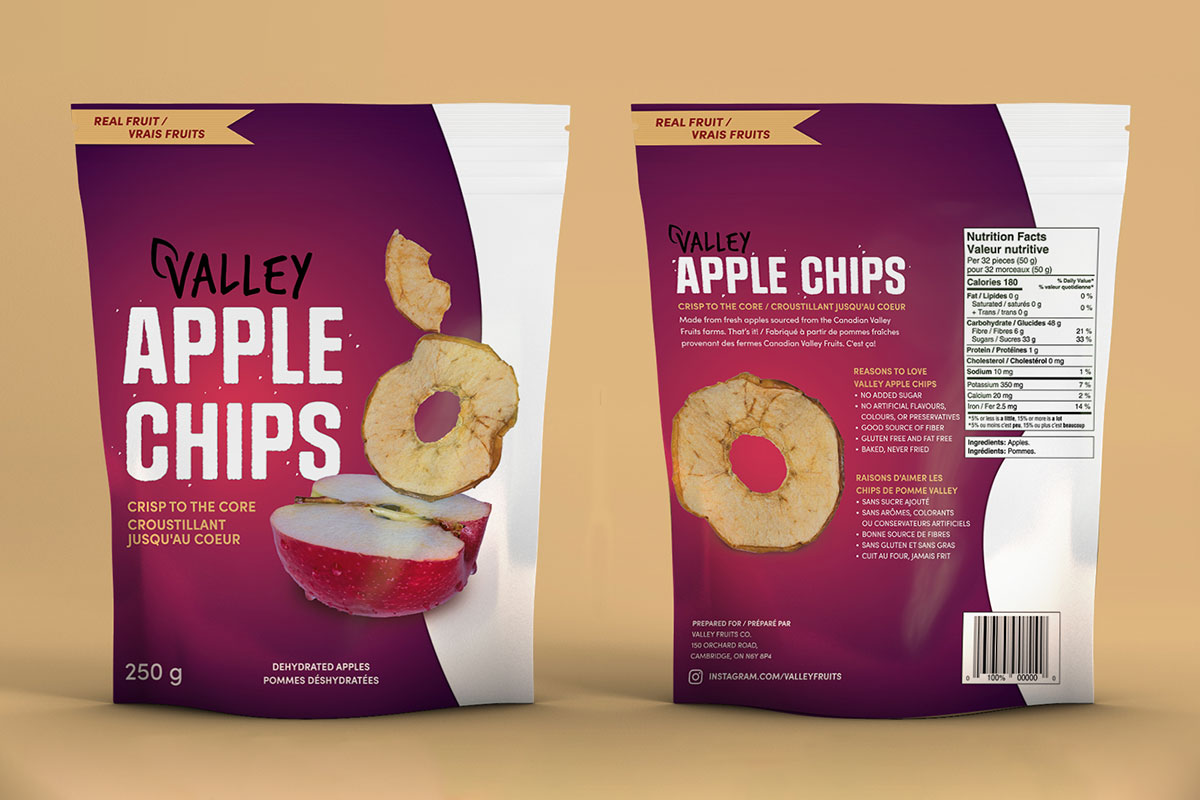
Valley Apple Chips
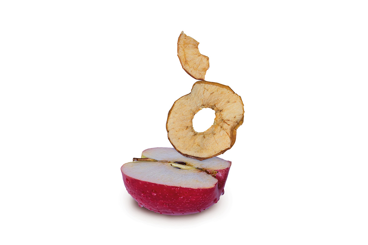
The goal of this project was to design packaging that represented the feeling of desire. For this bag of apple chips, I chose an ingredient-story concept to present desire through appetite appeal. The apple in the signature visual on the front of the bag has water droplets making it look fresh and juicy to viewers. To further convey the emotion of desire, I used shadows and a gradient on the packaging to create depth. These elements point consumers towards the main visuals while creating an enticing scene they feel like they can reach into. Moreover, when researching "desire" there was lots of imagery with black and dark colours which is why I opted for a dark background and the use of shadows. For the background, I selected a shade of dark purple and red because they are passionate colours and compliment the feeling of want or love in relation to desire. Furthermore, from my research, I found that other popular apple chip brands do not use the colour purple, which makes this package stand out among competitors. Additionally, there is a curvy silhouette on the right side of the package which leads the viewer through the dynamic apple visual. This shape subtly flows like a person's body, which is another piece of imagery I found often represented in media portraying desire.