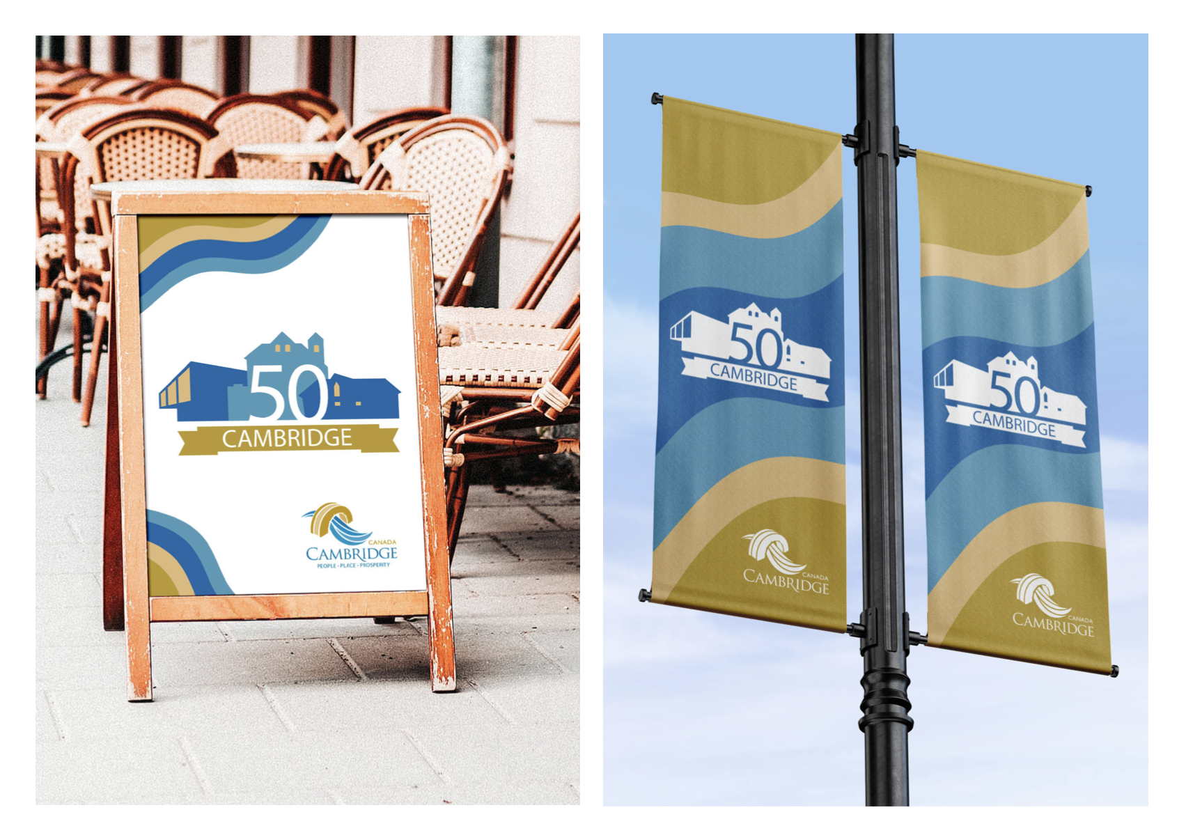
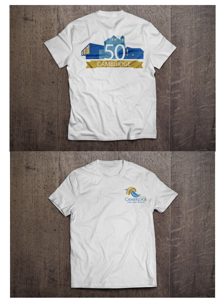
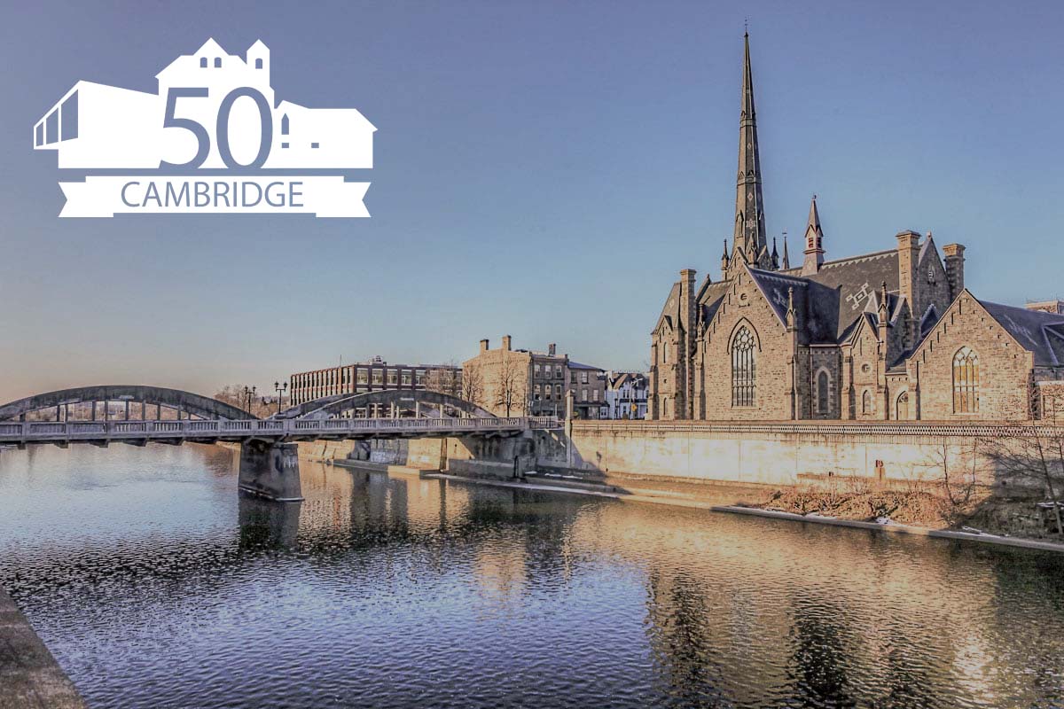
CITY OF CAMBRIDGE 50TH IDENTIFIER
This project was a partner project to design an identifier for the City of Cambridge (CoC) for their fiftieth anniversary. The identifier was a logo that the CoC could use as a marketing tool to promote their special occasion. This identifier had to be versatile because it was to be potentially used in advertisements for the CoC, on the CoC website, and applied to apparel to their anniversary.
My partner and I came up with the idea to illustrate three significant buildings that represented the CoC, and to knock out the number 50 within those buildings. The word “Cambridge” was placed on a ribbon underneath the buildings to provide some balance and visual hierarchy. The contributions that I made to this project were the windows and placement of the ribbon. I also suggested to knock out the numbers and letters to make a strong cohesive logo.
The colours my partner and I chose were significant to the City of Cambridge because they were the specified colours in their brand guide. These are the same colours that are used the CoC logo. The yellow was used for the windows to give life and character to our identifier to give the illusion that the lights are on in each of the buildings and that someone is “home”.
The most challenging aspect of this project was researching and choosing each significant building to use in our logo because there were so many historical buildings for each city except Preston. We finally came across the Preston Scouts House, and we were able to use that as a part of our identifier.