Beer Branding : Hill and Sons Brewing Company
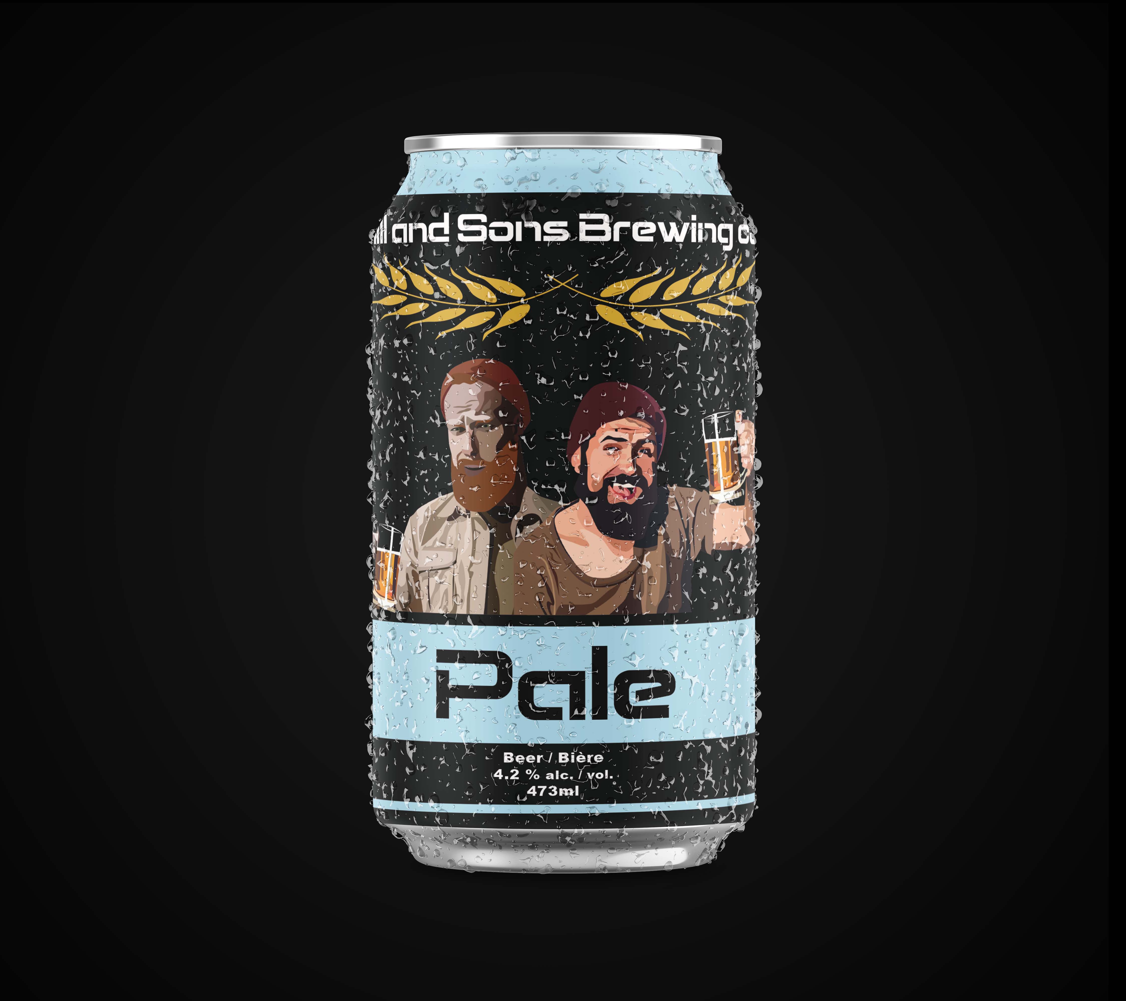
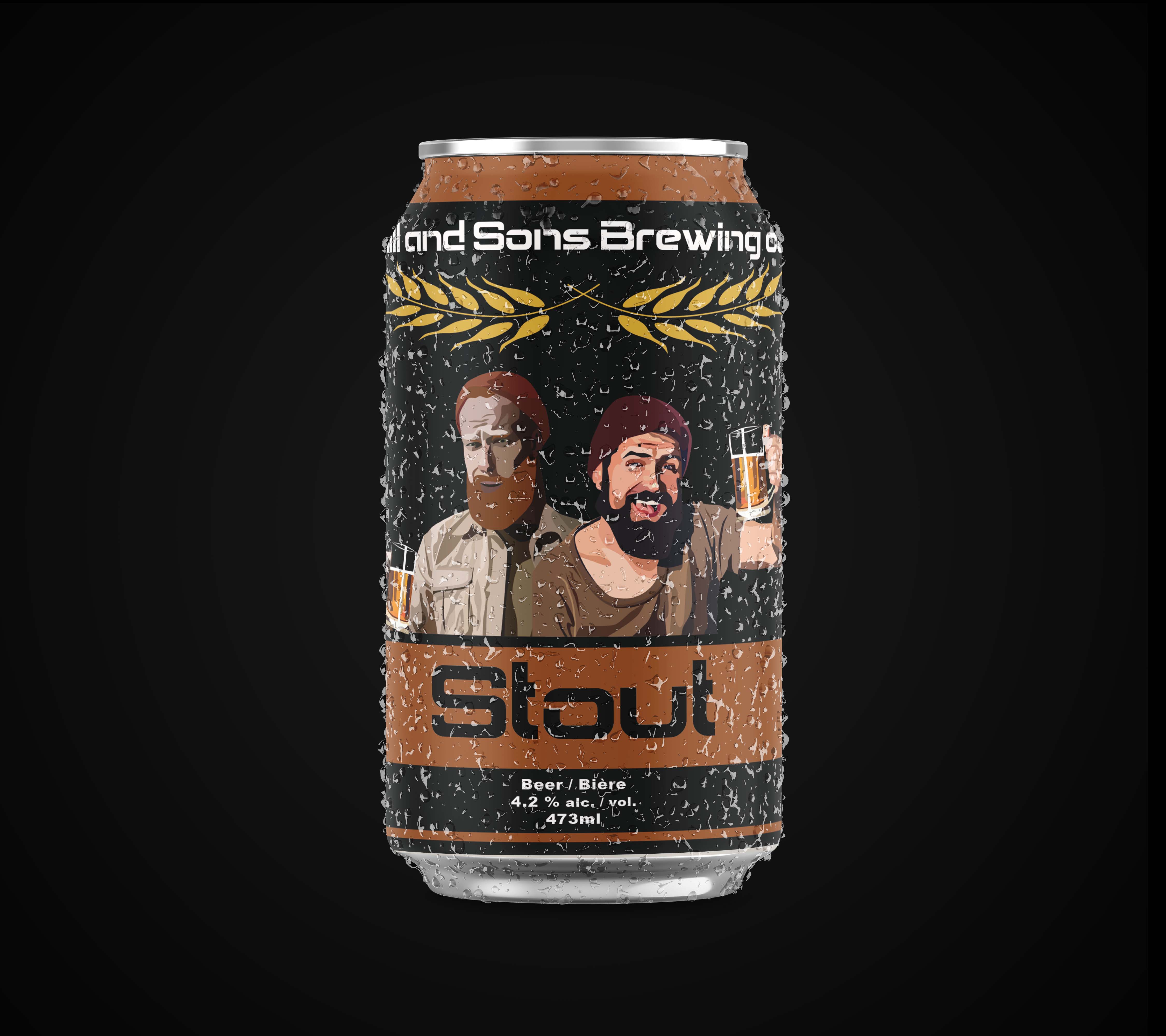
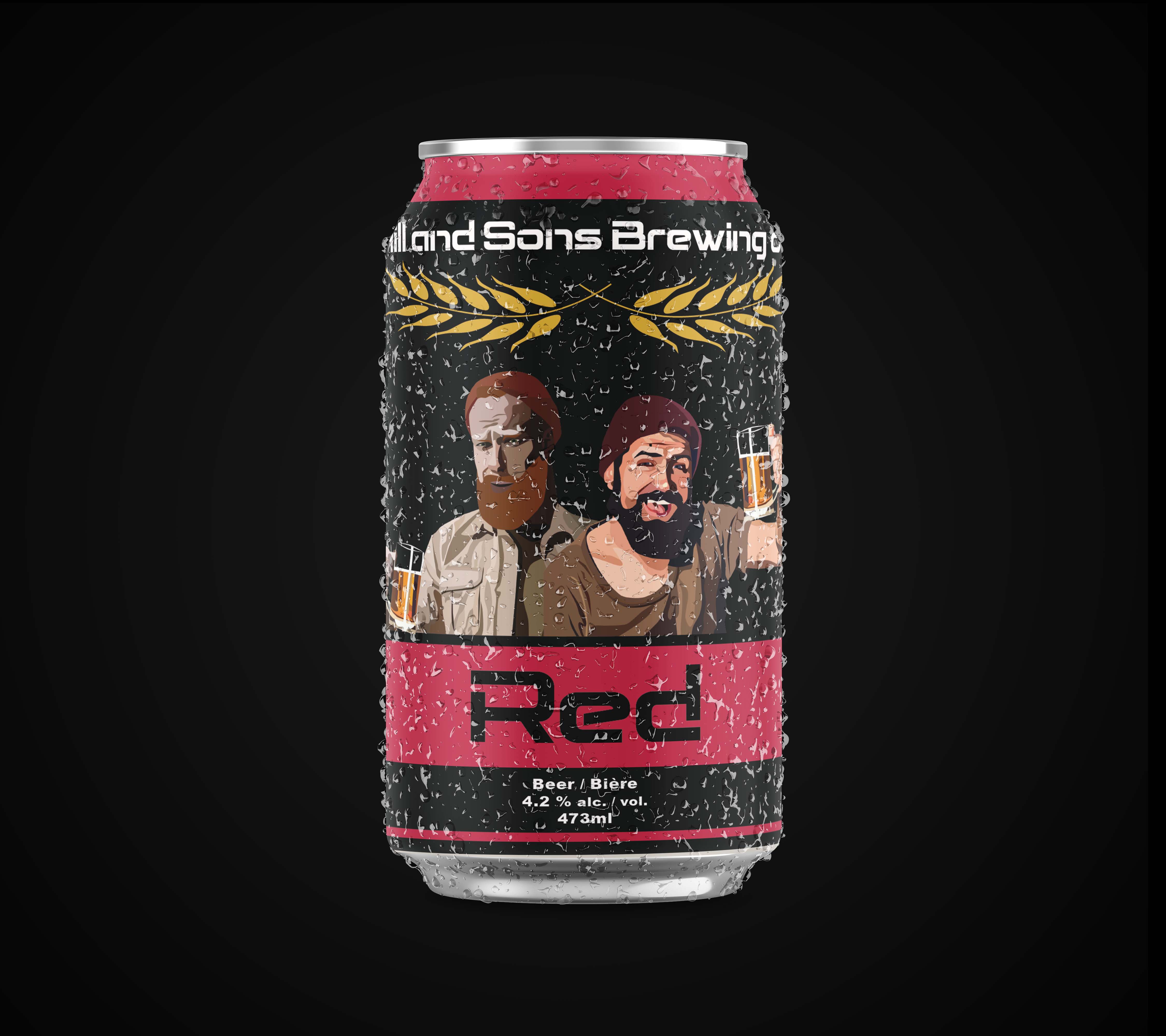
In my packaging class I was given the project ‘Beer Branding’ where I had the task to create my own beer brand. I was given the name ‘Hill and Sons Brewing Company’ and given the task to rebrand the brewing company and create their primary product offerings. The project was an individual assignment that lasted seven weeks. For my rebrand I decided to keep the corporate name as the main brand identifier and then created three separate flavours of beer that included red, pale, and stout for the offering. The cans and logo were designed in illustrator. For the design of the logo I used a smooth and blocked letter typeface that I felt brought a fresh look to the design. For the logo icon I used a golden wheat vector to frame the text. For the can design I created a photographic digital painting of the brothers. This image helped to show the personality and the wholesomeness of the family. I used a simple black background on the can to allow the images to stand out. Then I used a single spot colour for each flavour offering.This project helped me to strengthen my time management skills. I created weekly deadlines to have different pieces finished to have ample time for feedback from my professor. Overall, I was able to create a simple and clean rebrand for the brewing company.