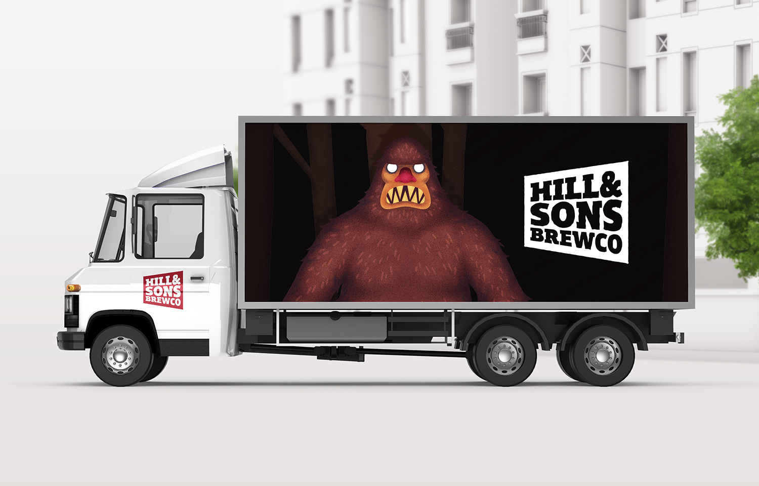
Hill and Sons Brewing Company
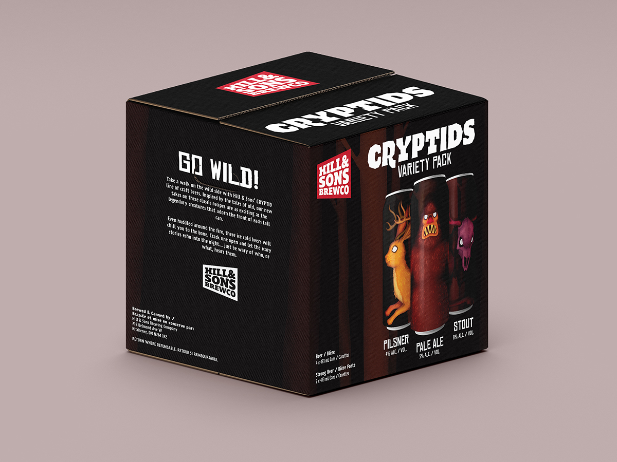
I was tasked with creating a unique identity for a local brewery called Hill and Sons Brewing Company. The identity consisted of a logo for the brand, as well as a line of three related beer can designs that worked harmoniously to create a strong visual set to launch the brewery’s first line of craft beers.
The logo was created through a series of iterations, all playing with bold, heavy text, while attempting to maintain a sense of playfulness and excitement. The final logo features the Hill and Sons name knocked out of a solid, bugle-shaped box that speaks loudly to the consumer, “Pay attention! These beers are something special!”
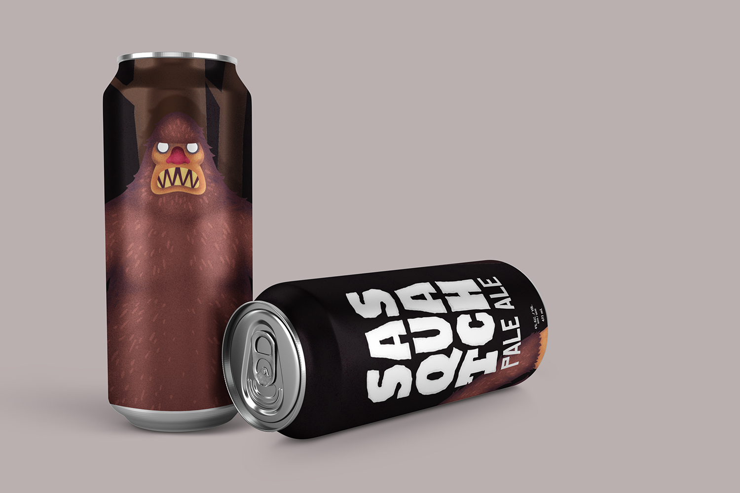
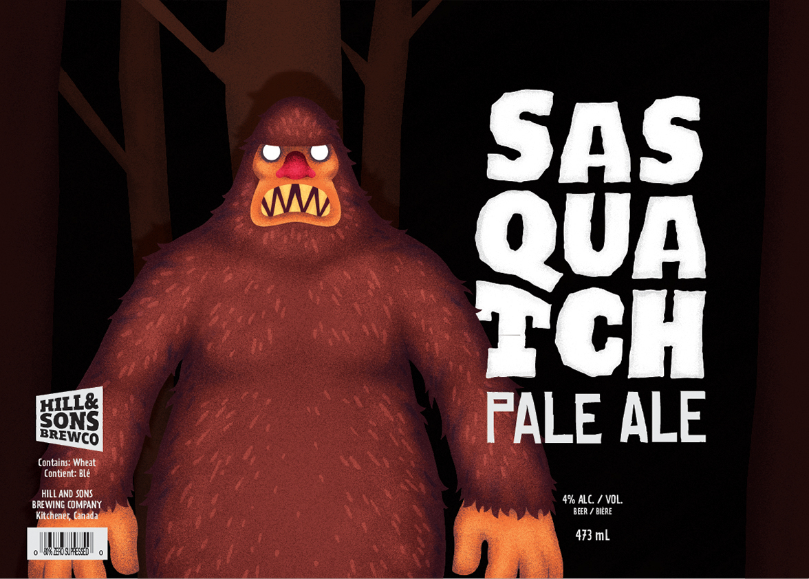
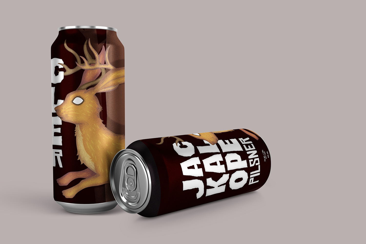
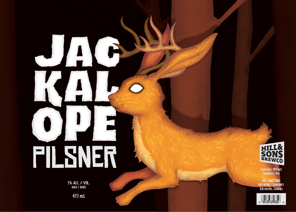
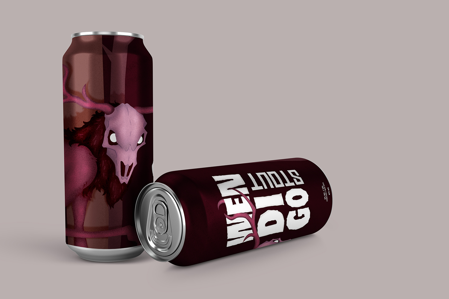
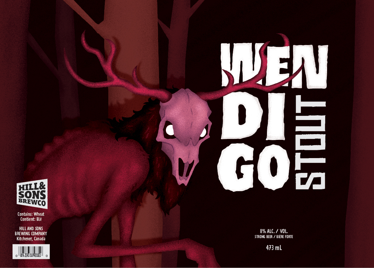
The beer can designs were created with the common theme of Cryptids (creatures from old folk tales) that have wandered out from the woods to find the consumer and their friends telling scary campfire stories. The designs take a stylistic, illustrated approach for the core visuals that are intended to be both frightening and attractive, using bold, white type against the colourful, textured illustrations to grab the consumer’s attention and tell the story that is implied by each beer can.
The colours all revolved around warm palettes to further imply the story’s setting of being around a campfire, as well as to represent the warm yellows, browns and reds of the delicious craft beer inside each can. The typeface and imagery are both large and bold — taking up the majority of the can’s display area — to imply both the enormity of the creatures as well as the implied “big” flavour.
This project was a challenging one due to the tandem use of texturing, colouring, and shading techniques that I hadn’t had in-depth experience with. Despite my lack of experience with the aforementioned techniques, the end result was almost exactly what I had intended from the conception of the original sketches that were presented.