Typography
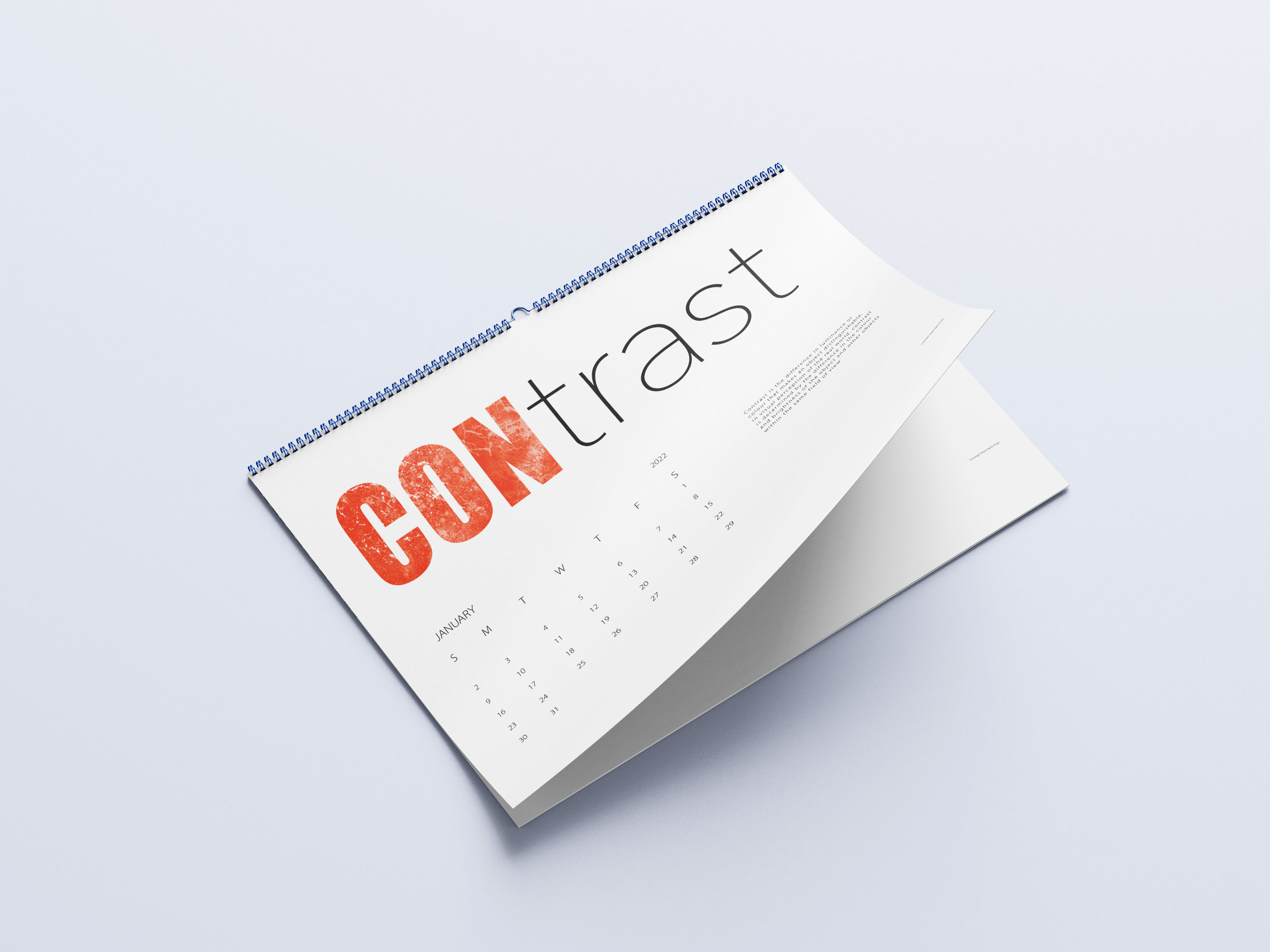
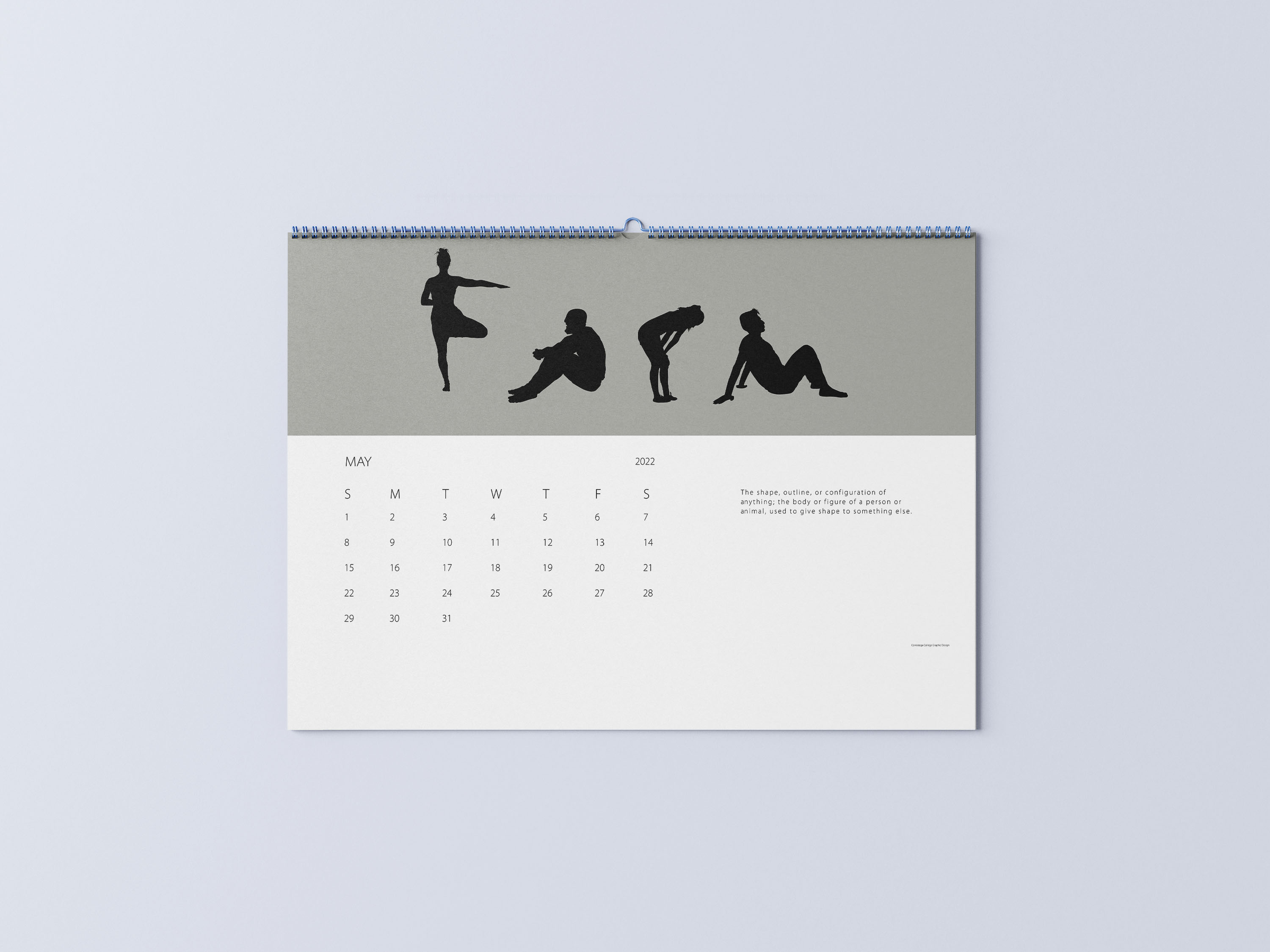
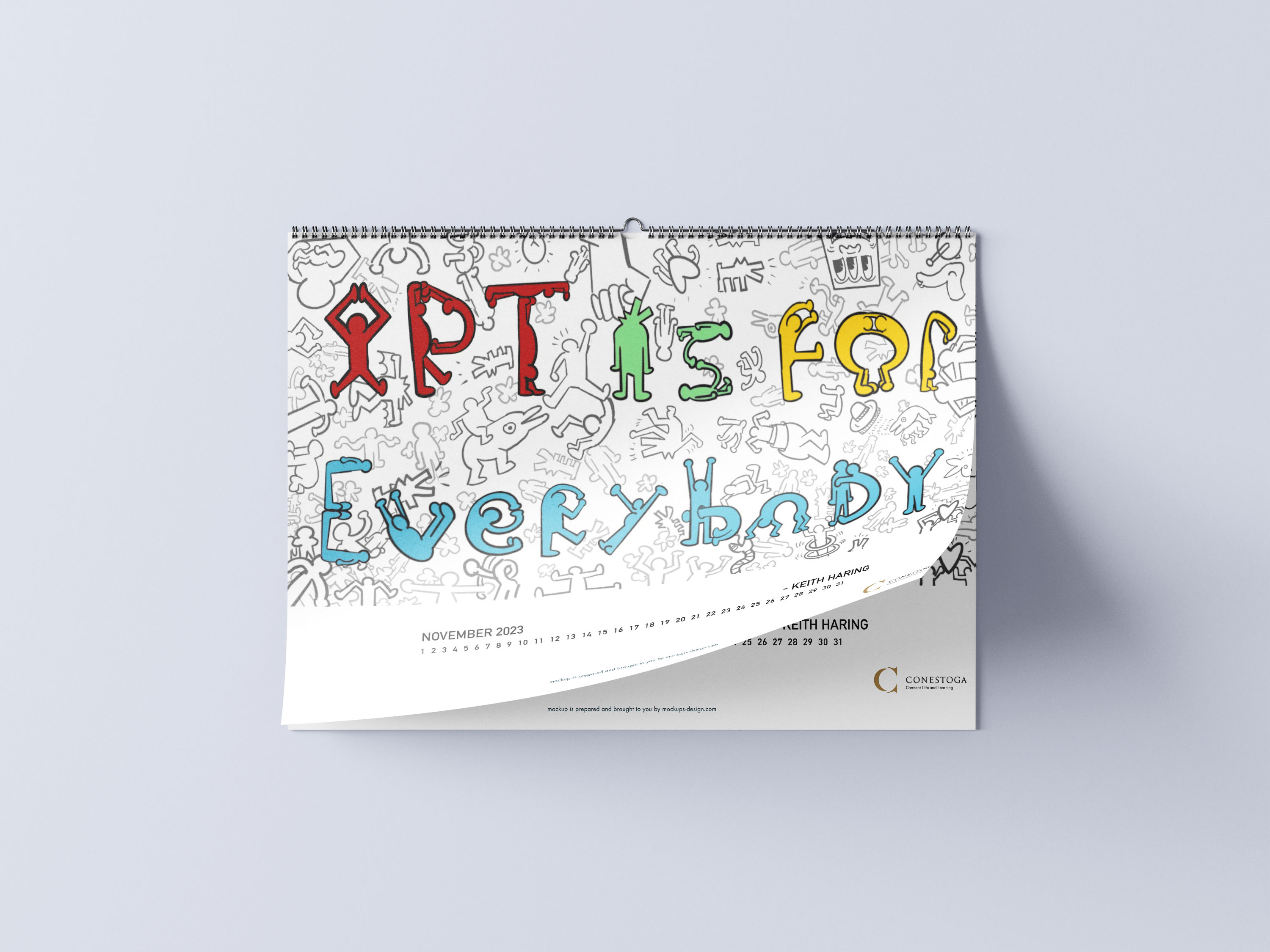
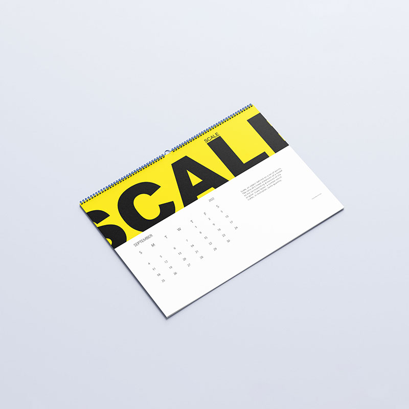
The purpose of this project was to create a typographic calendar based on themes given in class. The first three were just random art terms: “Contrast, Form, and Scale” Contrast and scale are pretty self explanatory: Big word with small word, and thicc letter beside thin letter. Now form that one is special, and it’s not just because I’m the M at the end… okay maybe it is. Do you see the modeling skills here!? Essentially these are positions of people that I traced in Adobe Illustrator which can resemble the letters to spell “form”. The last one was a Keith Haring quote “Art is for Everybody” inspired and drawn in his style.