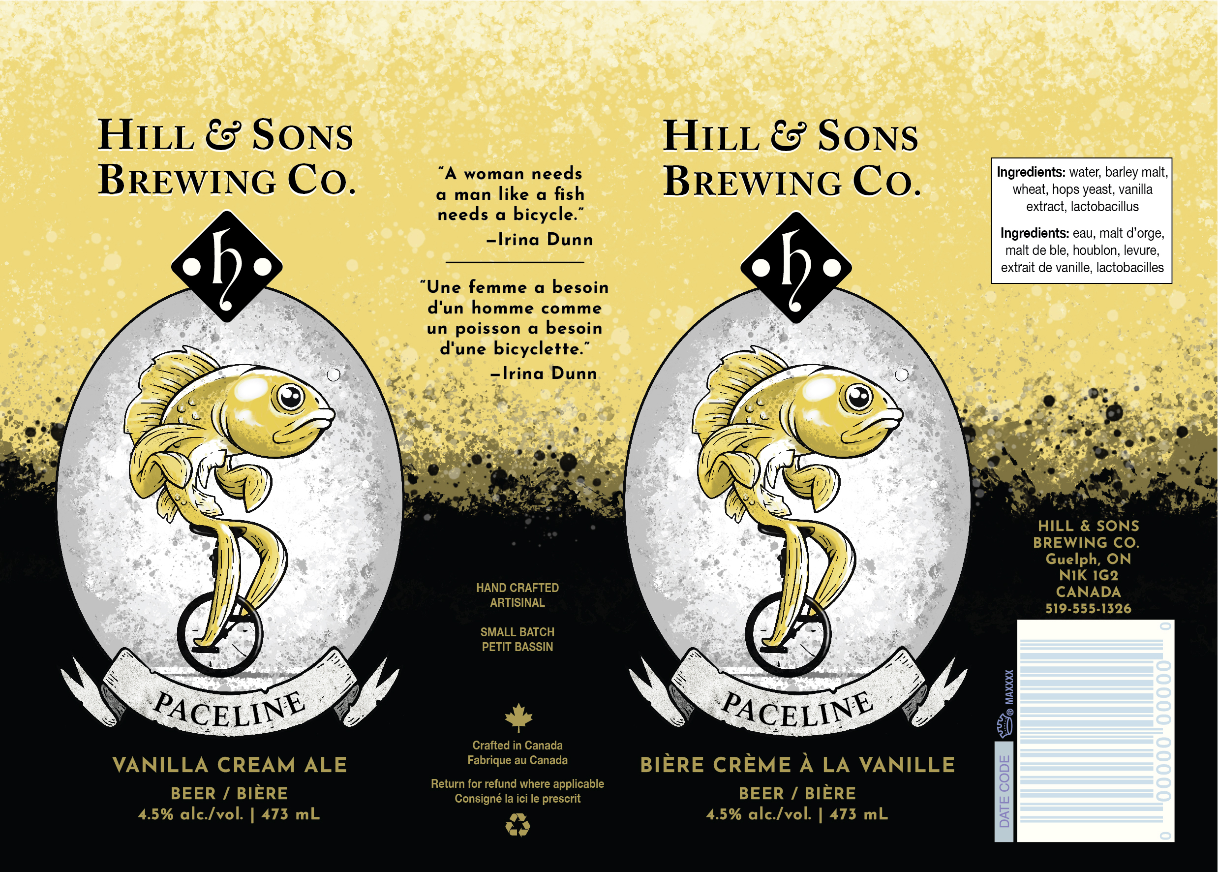
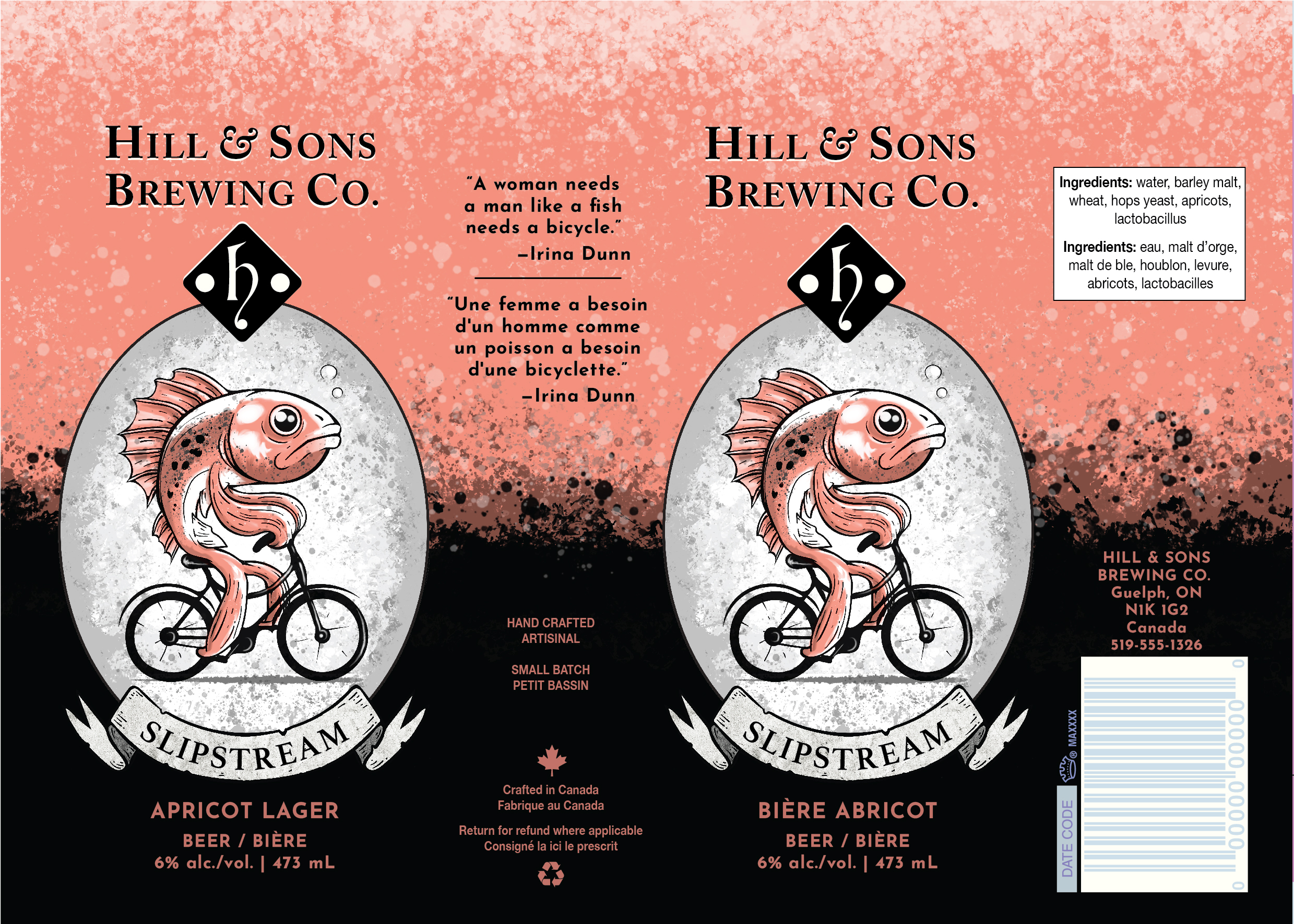
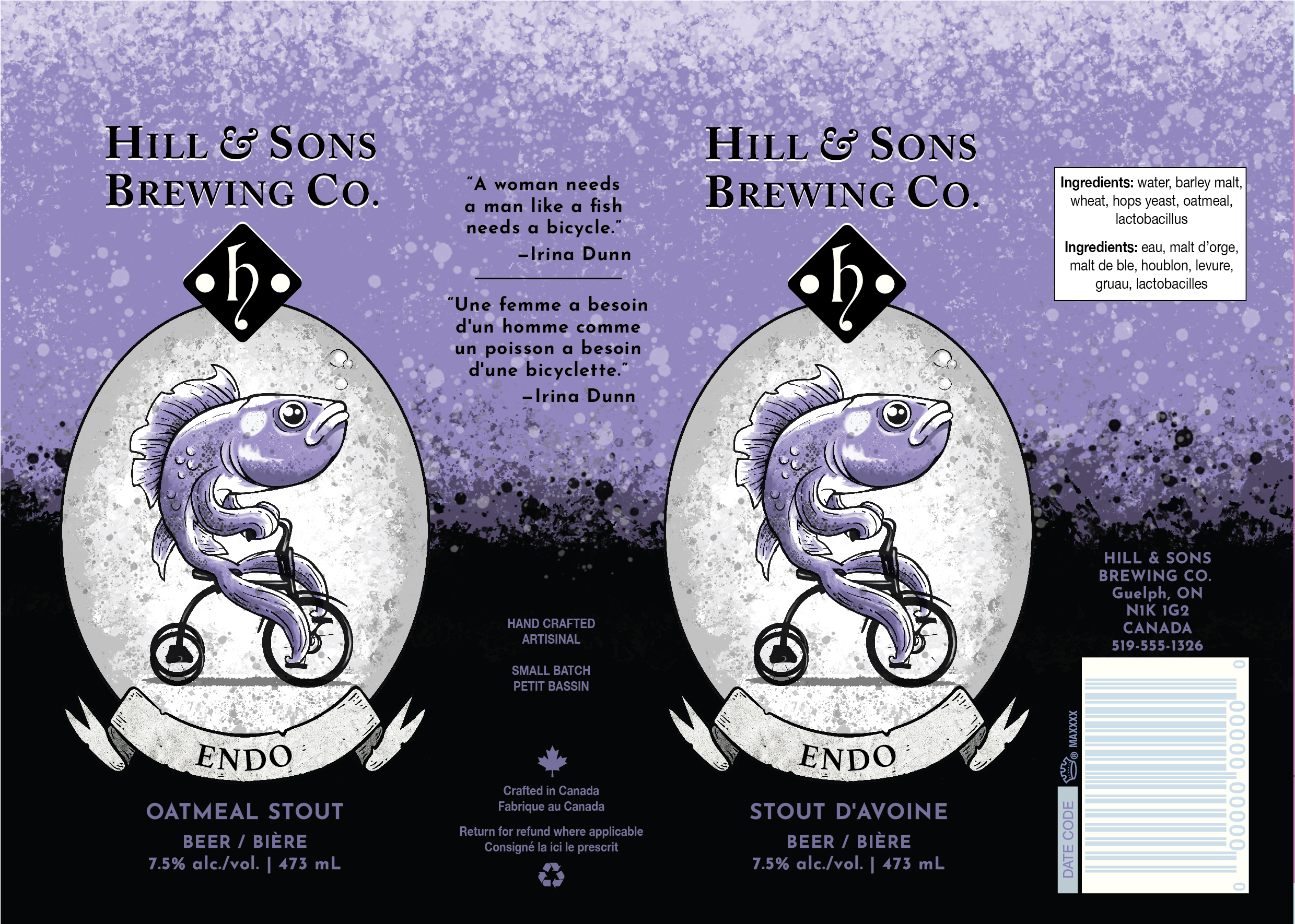
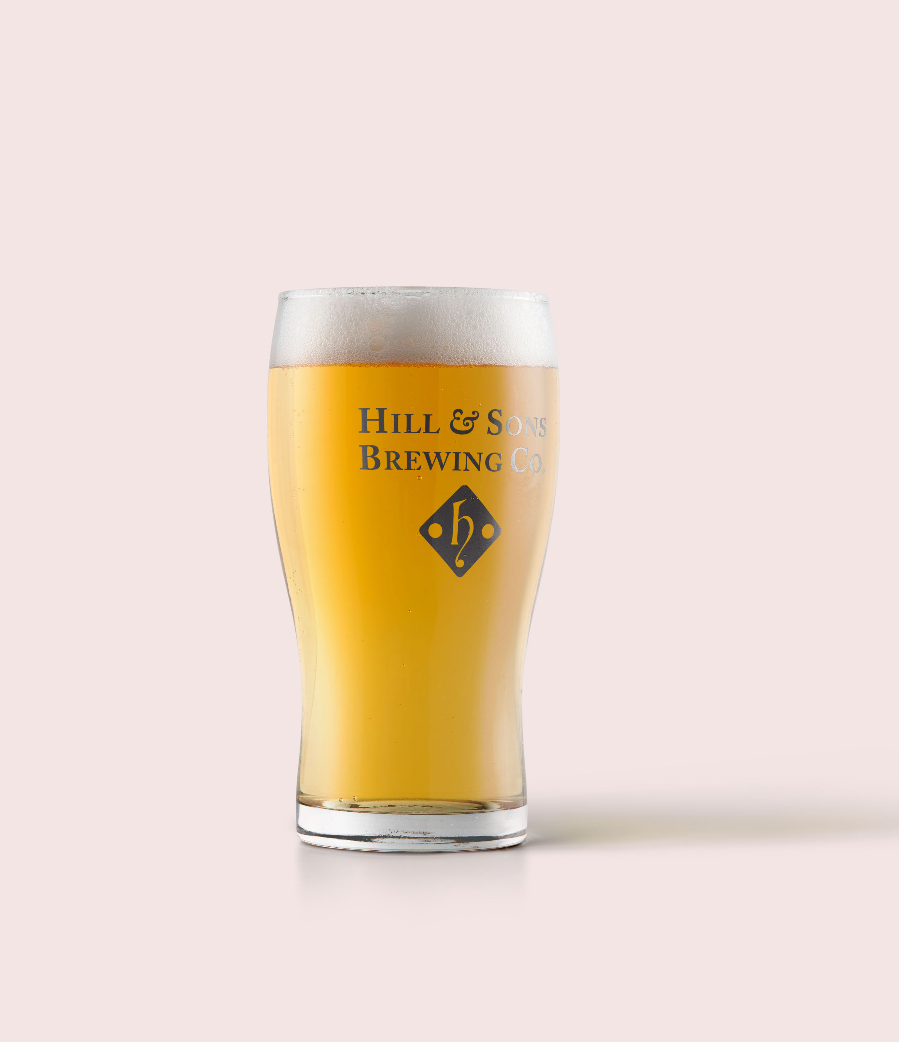
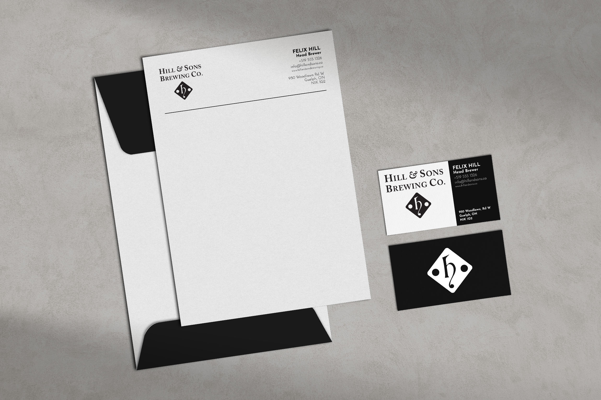
Beer Branding
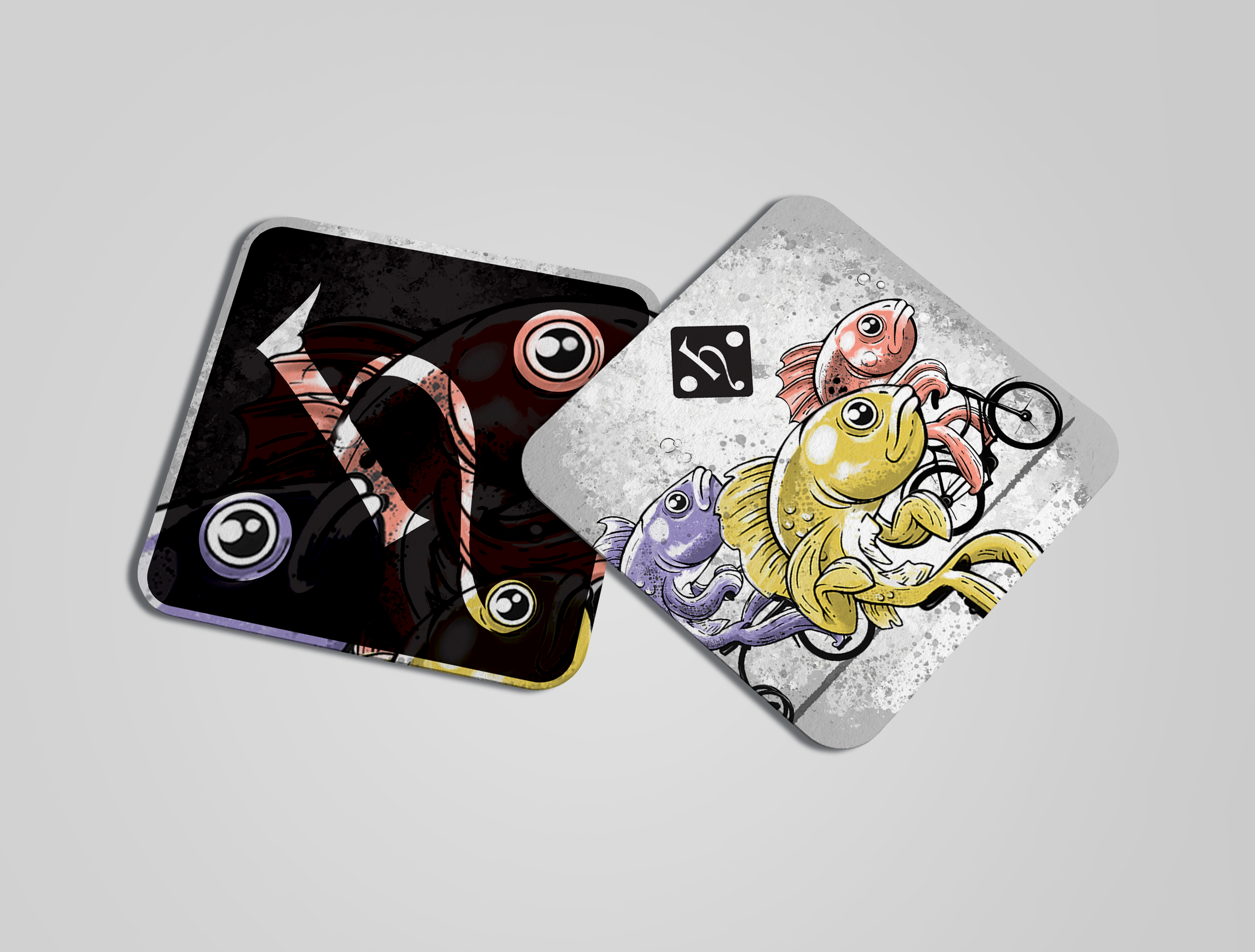
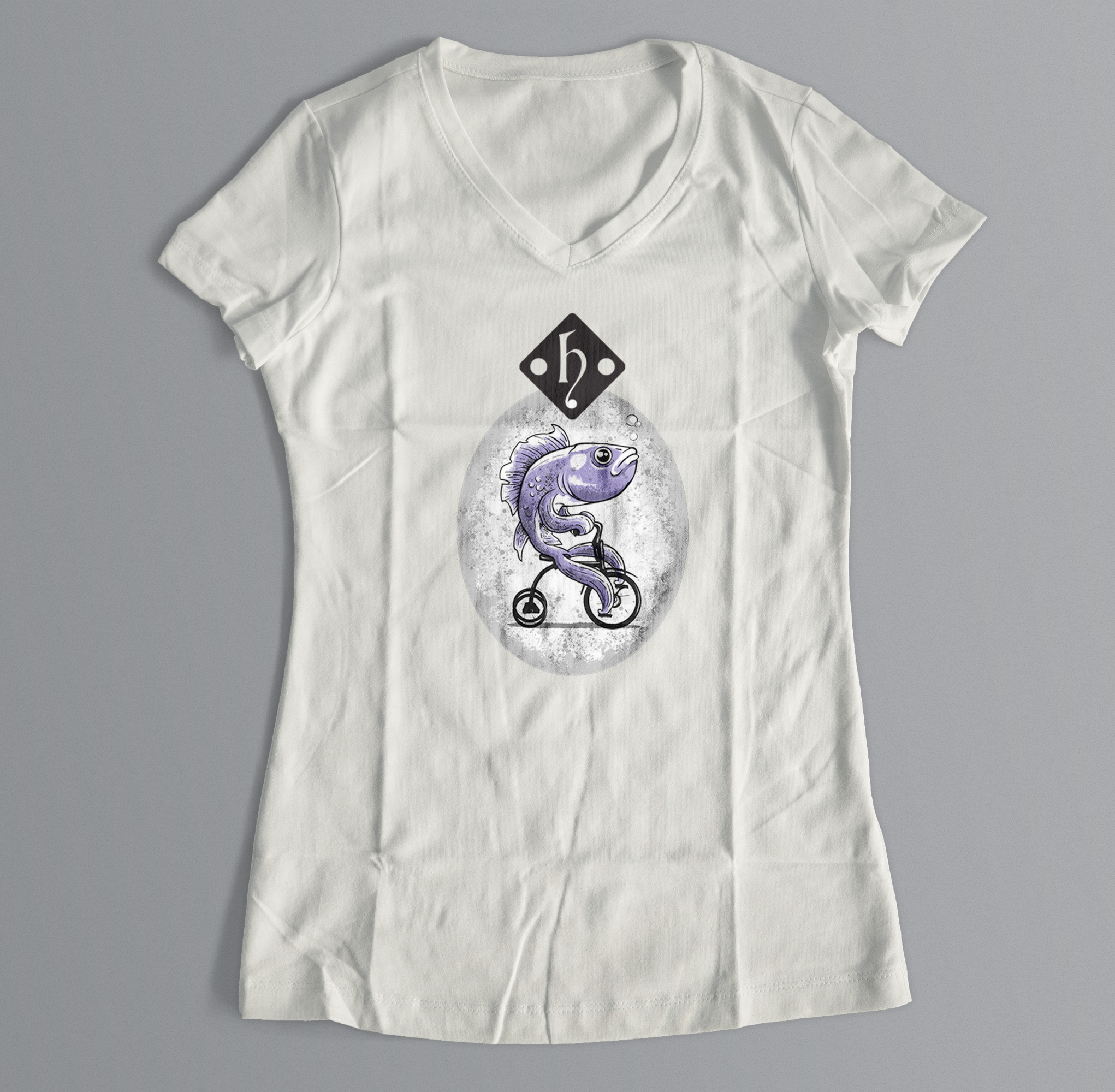
Branding for the fictional micro-brewery, Hill & Sons Brewing Co. The h-diamond logo is constructed to suggest a hill with the curve of the “h” while the sons (ie suns) are represented by the two circles on either side. A lot of alcohol is marketed towards men, so the idea with this line of beers—unofficially dubbed “Finline,”combining finish line and fishing line—is an attempt to balance that by aiming it at women. The starting point was inspiration from the feminist slogan, “A woman needs a man like a fish needs a bicycle."
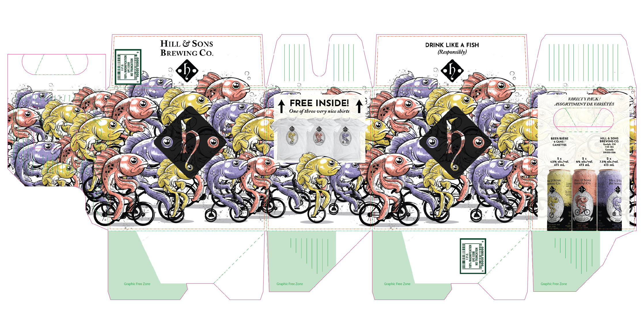
The more wheels the fish is riding, the higher the alcohol content. The design creates a sense of whimsy, keeping in line with the tone of a lot of craft breweries. The coloured mascots for each product are portrayed as riding different cycles with increasing amounts of wheels, indicating different levels of alcohol. Paceline is the starting point, setting the pace for the evening. Slipstream is for smooth sailing, coasting through the race/night. Endo is for going off the rails, flipping end-over-end.
All artwork and designs were created for three cans and a box (that holds six cans). The design’s elements were repurposed and applied to a variety of mockups—including t-shirts, coasters, and glassware—in Adobe PhotoShop. It was a challenge to find a balance between the hero graphic and the text without overloading one or the other. Two face panels became the perfect solution. Creating one layout allowed for a kind of template for the other two, while there still remained a challenge to retain a cohesive tone and aesthetic.