City of Cambridge 50th
Anniversary Identifier
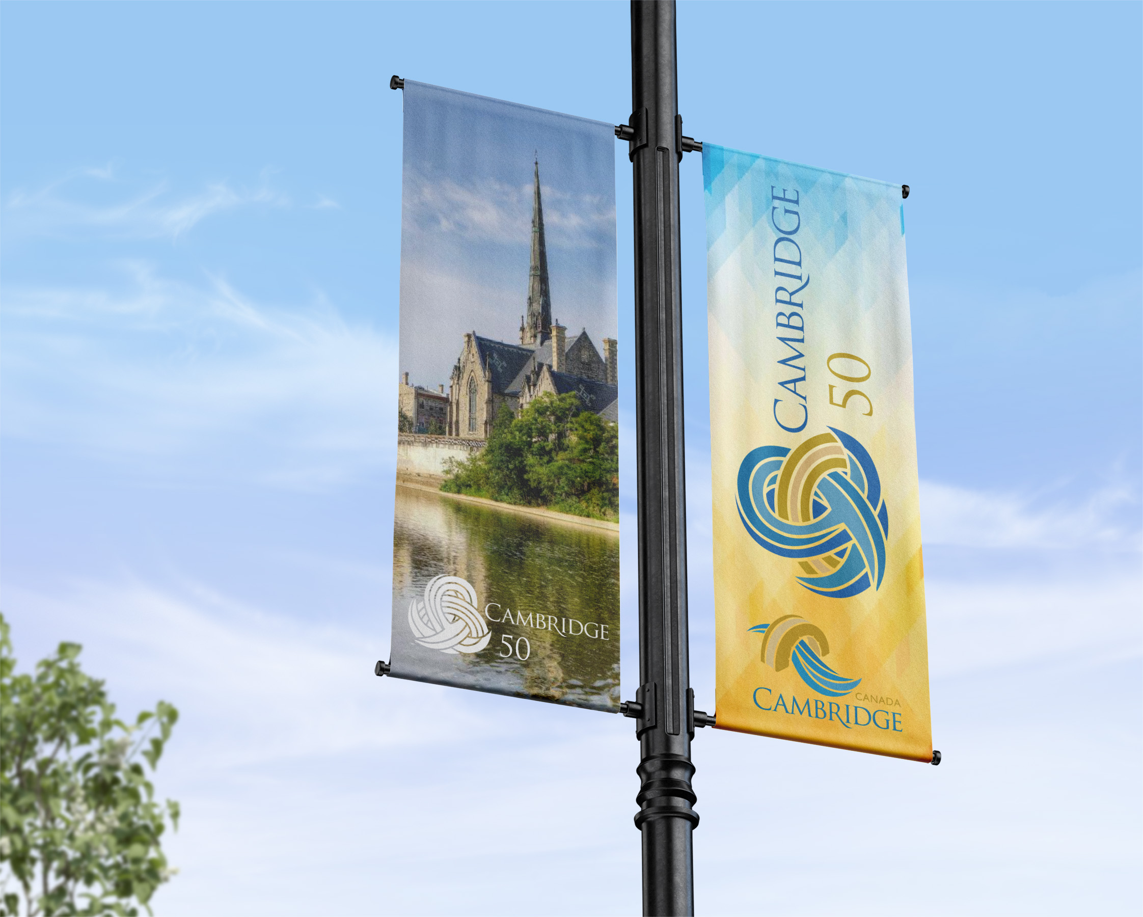
This was a partnered project for the City of Cambridge to create an identifier for their 2023 50th anniversary celebrations. The logo is to be applied to things such as merchandise, promotional content, and environmental signs. The logo needed to encapsulate something that represented Preston, Hespeler and Galt joining to become Cambridge. My partner and I researched the history of each town as well as their prominent buildings, architecture and what makes each unique. We worked from the City of Cambridge’s existing brand guide that outlined the colours and typography we could use. We worked collaboratively to work on and rework our sketches and concepts as we moved through our process and got feedback. Our final logo was inspired by a mobius loop and the existing City of Cambridge logo. It has different elements that are intertwined and incorporate the concept of the 3 towns within Cambridge forming 1 city. Our logo was created using a similar style to the existing City of Cambridge logo so it would appear cohesive alongside their existing one. I worked in illustrator to digitize our logo and take it to our final version. A challenge my partner and I faced was incorporating the 3 towns coming together as one without having too many elements or taking the route of focusing too much on the use of “50”. We overcame this by simplifying our logo down to be a styled icon that represents the city.