Beverage Branding
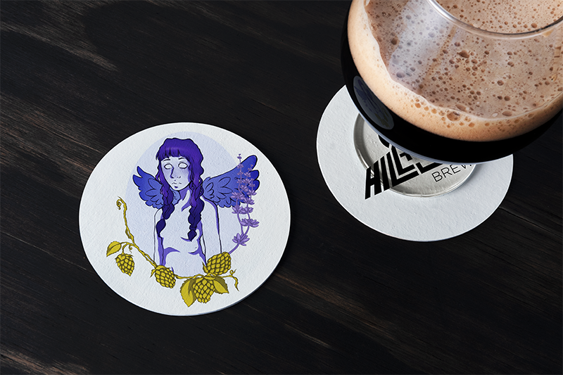
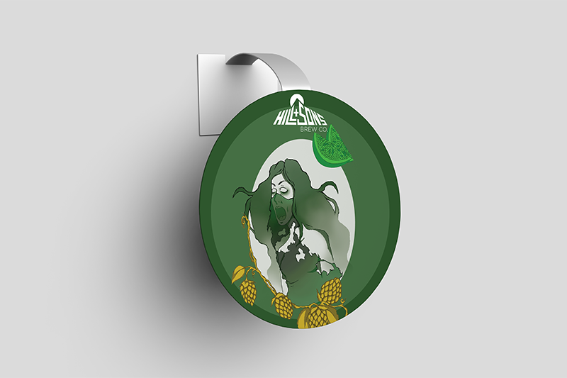
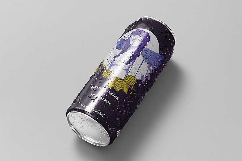
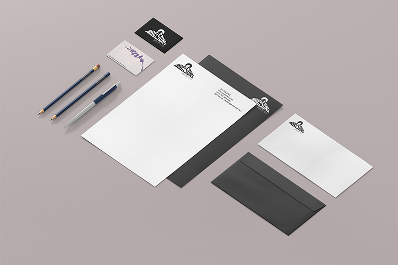
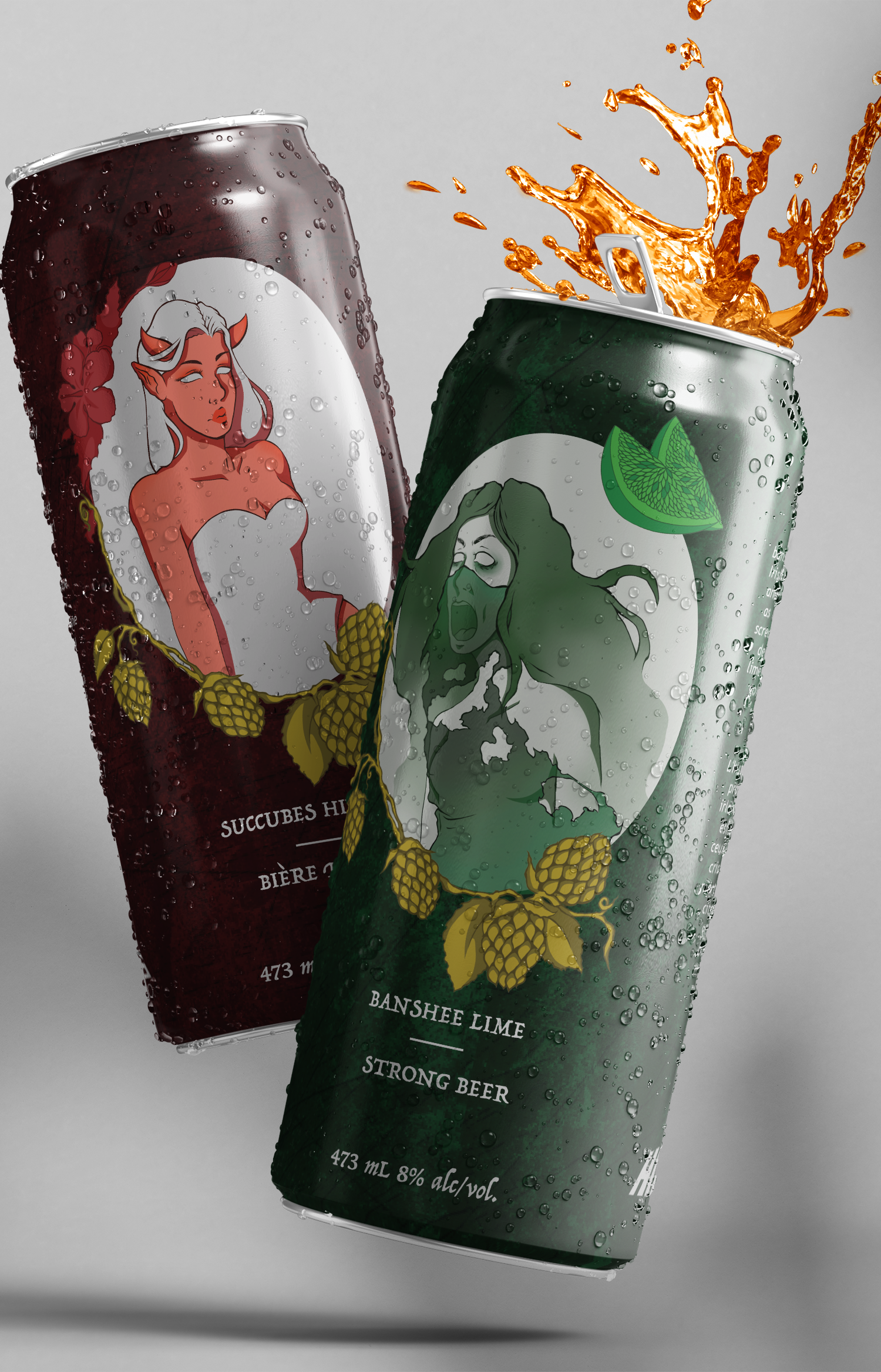
The goal of this project was to design a logo as well as branding for an alcoholic beverage. The only direction we were provided was the name of the company, Hill and Sons. This meant that we were given full creative freedom for all other aspects of this piece, and I chose to focus on an audience who had a similar level of knowledge of alcohol to me (which is next to none) and mainly only bought beer if it had an interesting label. After brainstorming ideas, I decided upon one that focused on mythological women who were seen as dangerous or deadly. I felt that focusing on characters would allow me to showcase not only my design skills but also my illustrative skills, and wanted to use gritty imagery with the use of scratched, rough textures, and matching type to fit in with the overall theme of my idea. I wanted each can to reflect the dark stories that would be told on each can, and for that reason, I also chose to have the main typeface look handwritten to make it feel as though it was being sent as a letter or almost as if it were a first person’s account of seeing these horrifying creatures. For every character, I used the description from folklore to show my interpretation for each of them, and from there chose to place them on a blank backdrop to really allow the illustrations to pop. I believed that adding more illustrations to provide appetite appeal would be a good idea so I adorned the border with a frame of each flavour- and each was chosen to fit a colour that would match the character .