Beverage Branding
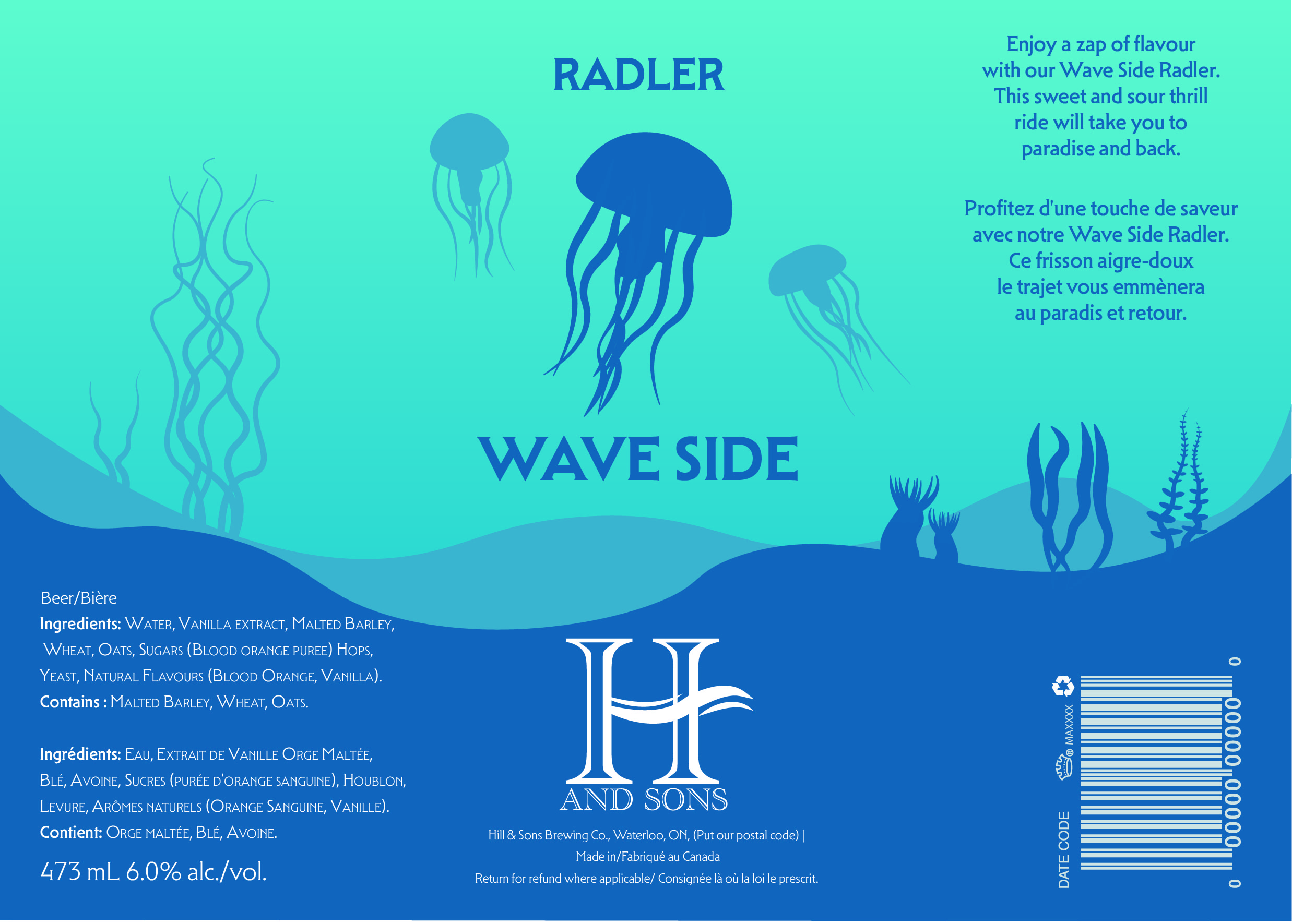
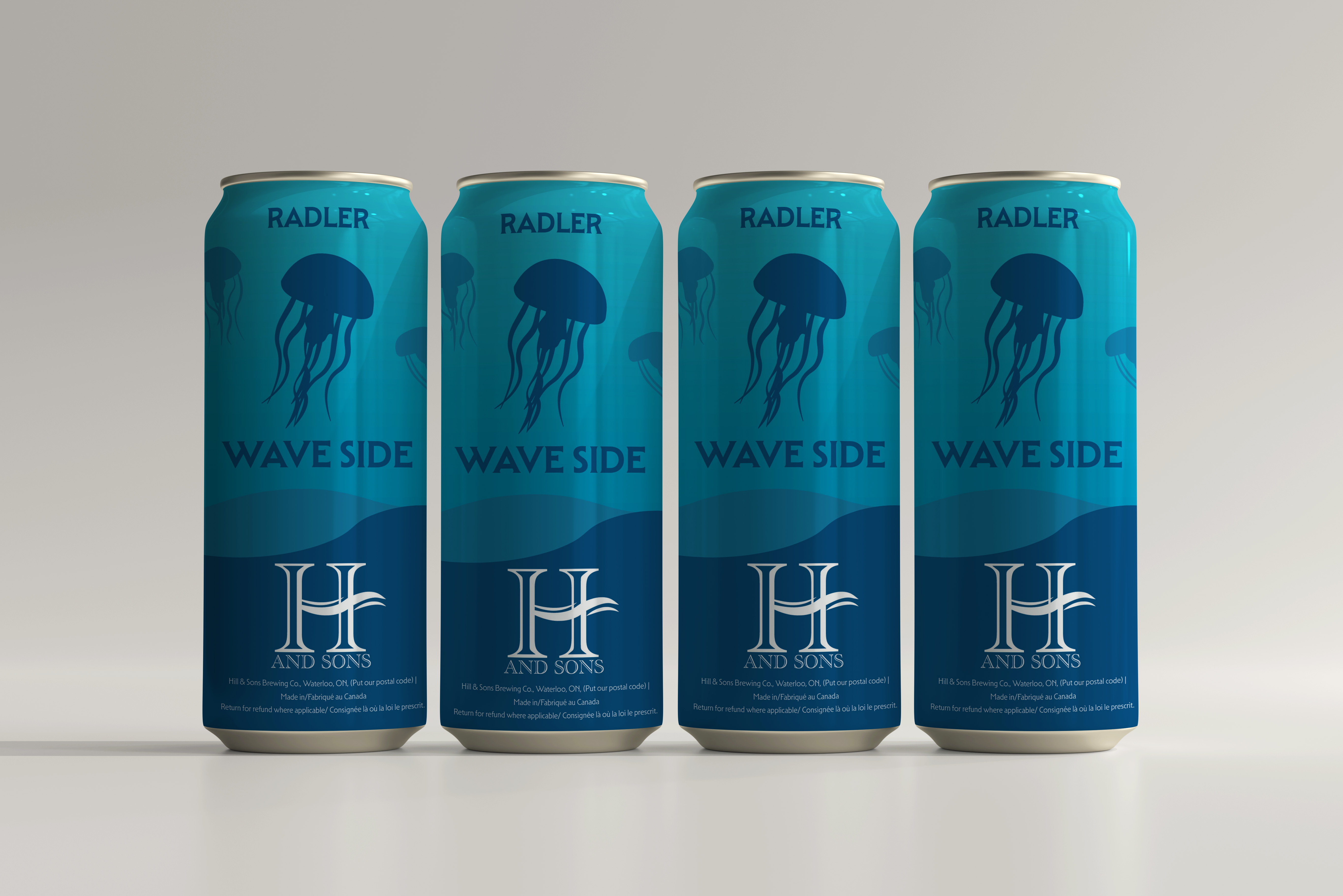
The designs of the cans were inspired by the various ocean levels and artistically displays a specific aquatic species that inhabits that area. The Wave Side Radler’s can was inspired by the euphotic level of the ocean. This level is closest to the surface and therefore has the most sunlight penetration. Because of this a light blue gradient background was used. The animal featured on this can was a jellyfish as blooms of jellyfish tend to occupy areas of water near the ocean surface.
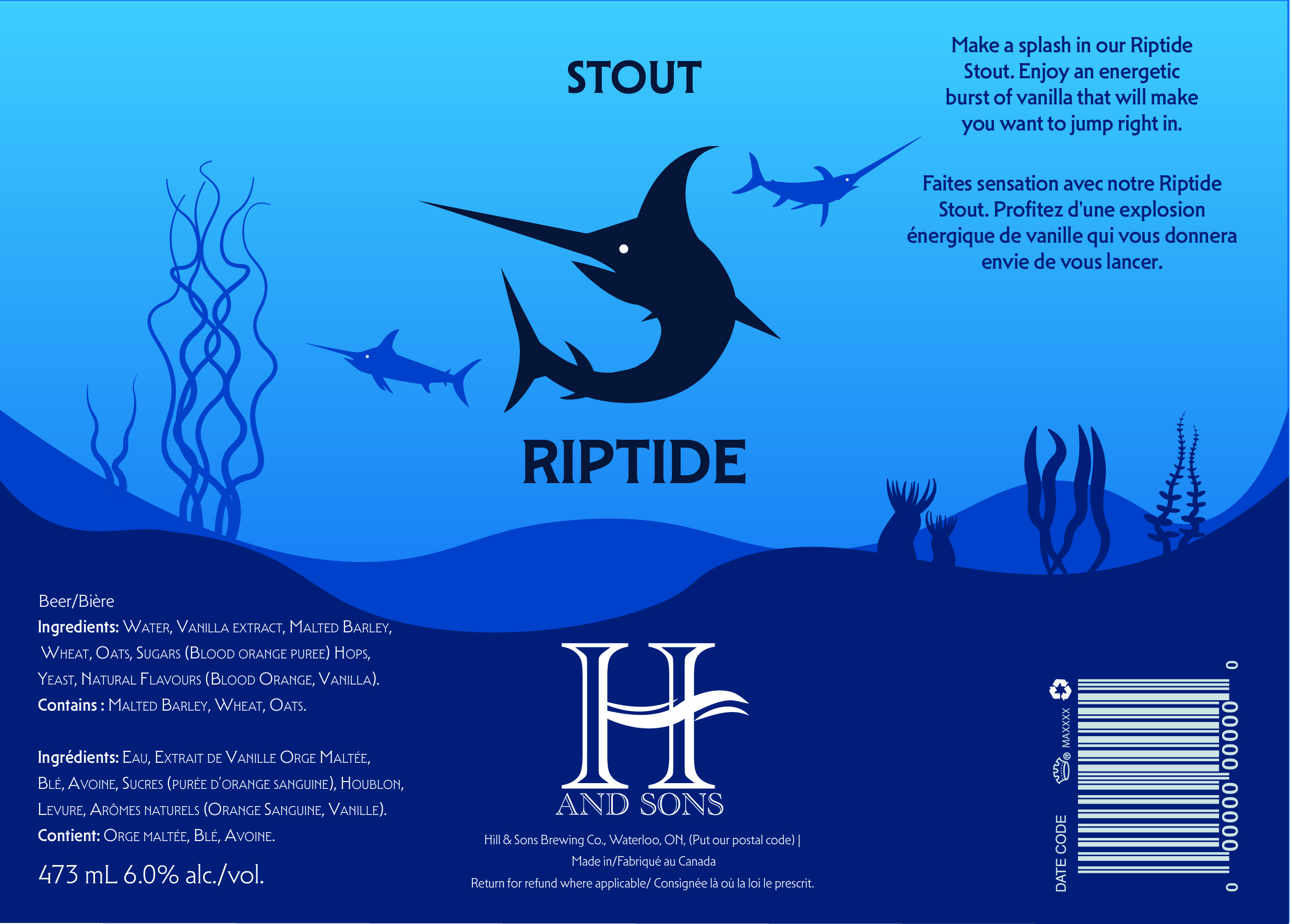
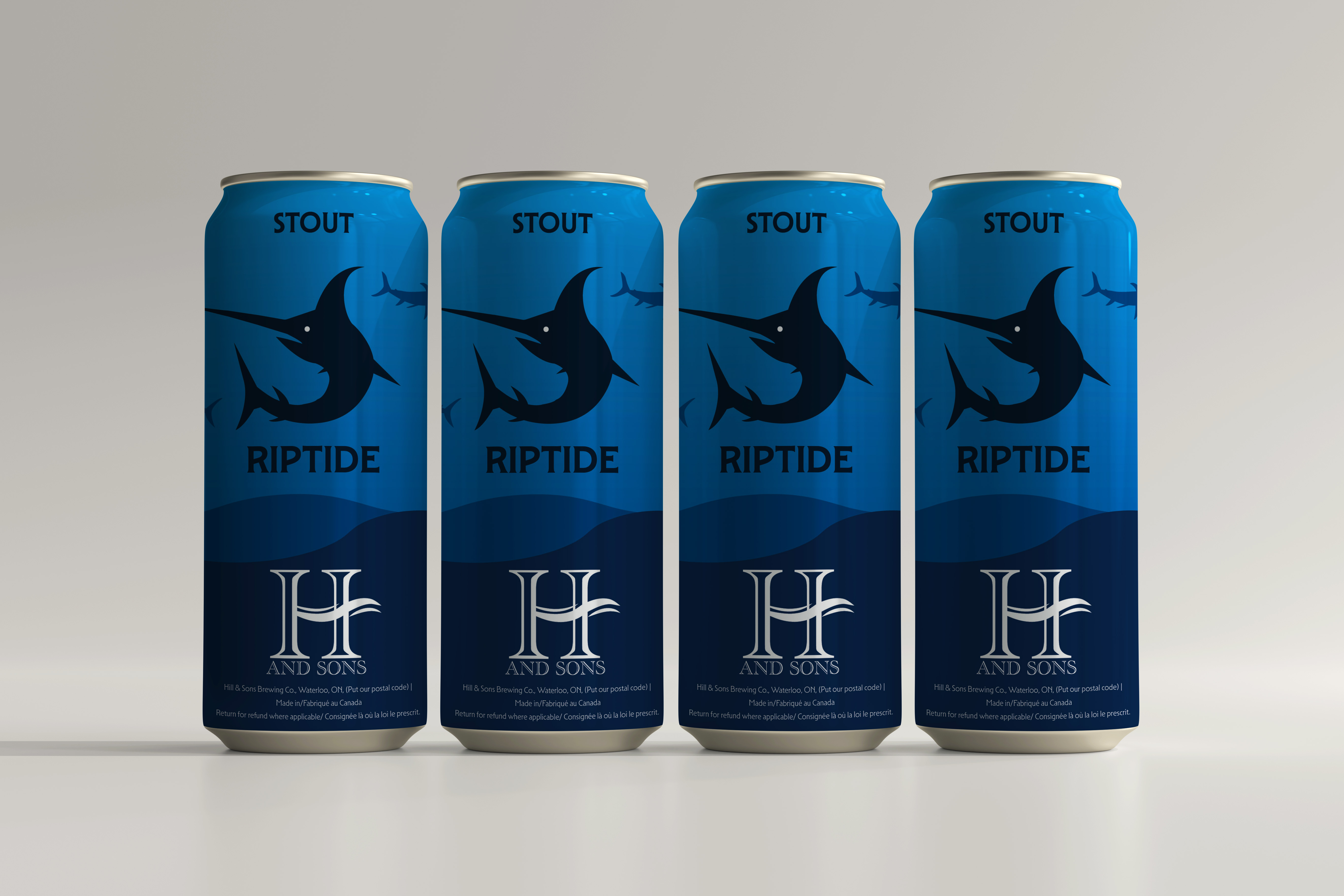
The Riptide Stout colour scheme was based off of the dysphotic level. This is where sun ray levels begin to drop and the water starts becoming darker. To properly incorporate this a deeper gradient was used. This can features a swordfish which is not only a fish that occupies this sea level, but also embodies the same time of quick and intense spunk as a an actual riptide.
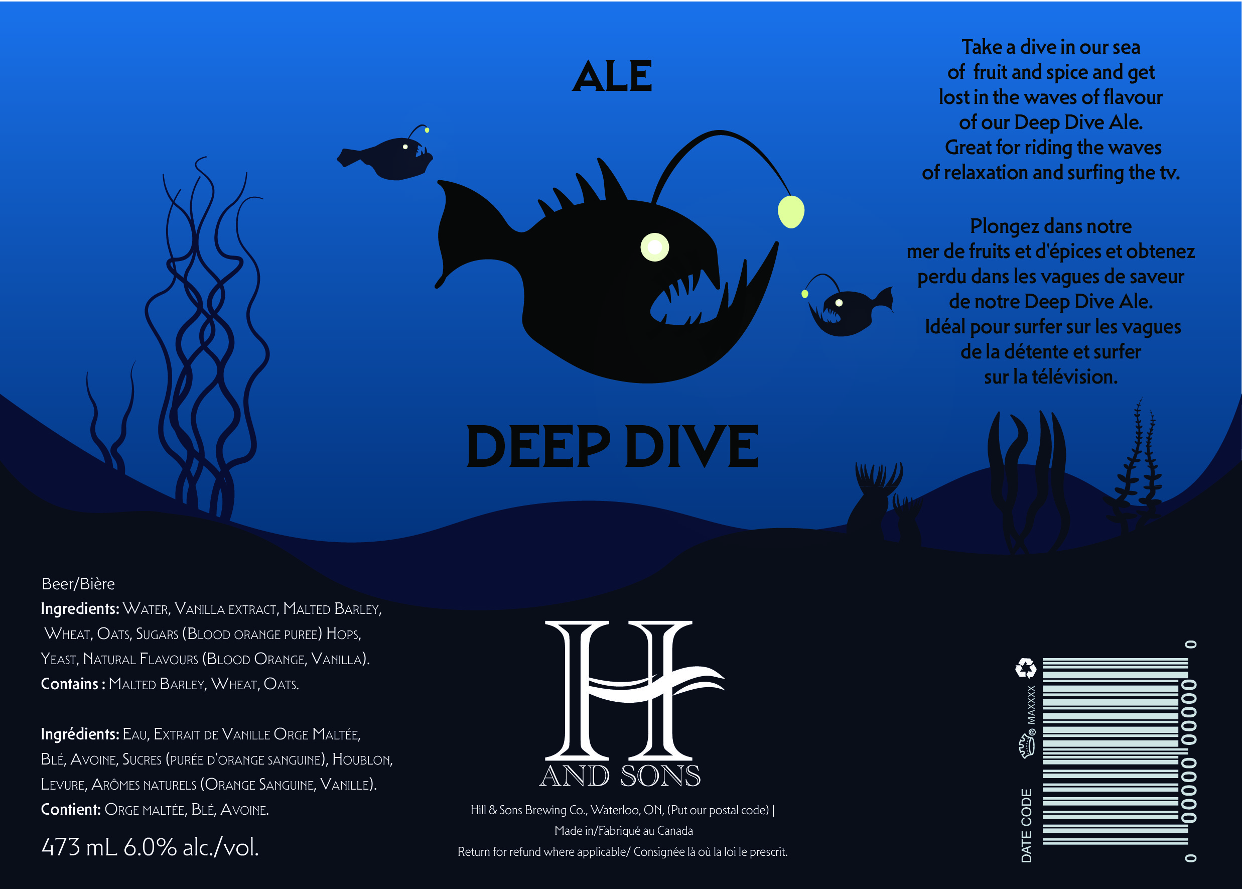
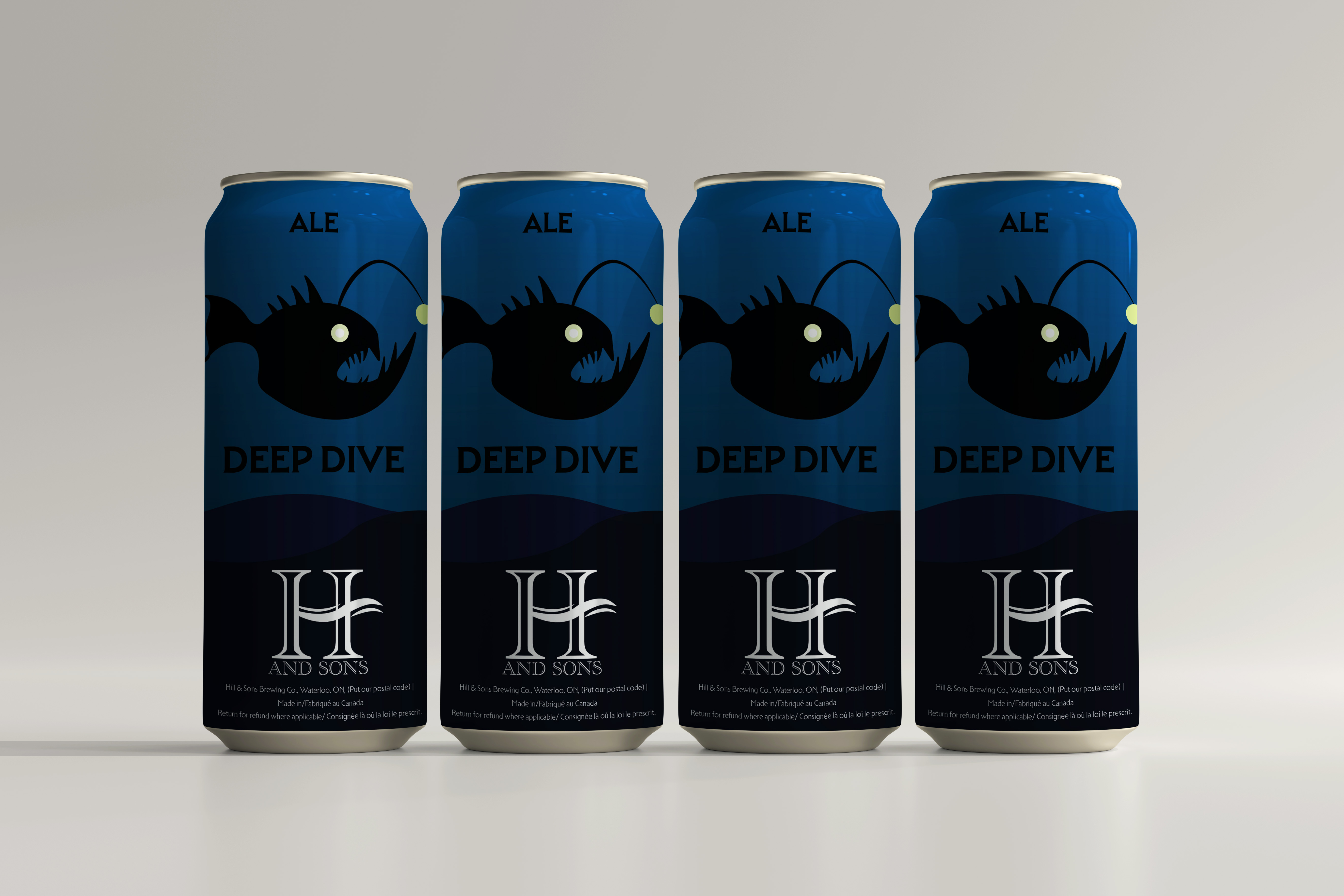
The third and final can takes place in the aphotic zone. The deepest region of the ocean. It seemed only appropriate that this can featured arguably one of the most notorious deep sea creatures: The Angler Fish. To properly incorporate the sea level this can exhibits the darkest colour scheme of the three cans.